domenica 23 ottobre 2011

architectural transitions

I remember back when I was in interior design school our professors (who were all architects by training) always asking us to consider the "transitions". To be honest, I couldn't really understand their fascination with how a stair was detailed, or how the inside and the outside of a building were connected, or how a countertop intersected with the cabinets in a kitchen.

I wanted to choose paint colours and furniture and materials and all of the other fun things we normally associate with interior design. The last thing I wanted to do was spend six hours drawing a detail of a stair tread!

Well, I'm happy to say now that I get it, I really get it! It is about the transitions. The ways in which spaces are connected together really does make a difference. It took awhile for it to sink in but I'm fully there now.

No where is this more true than in new buildings but it is also very important when bridging old-historical and contemporary together. Some of my favourite transitions are modern additions added to the backs or tops of traditional houses. (Perhaps, because this is what I dream of doing to our own Victorian some day.)

Even if you are just renovating your house room by room take some time to think about your doorways, hallways, stairs and mouldings. All combined the look of these things will make a big difference to your home.

So tell me the truth, do you take these things into consideration when designing your home? I know it's hard to spend money on a door when you want to fill your house with furniture and redo your bathroom but I think it might be worth it. Would you agree?

If you need more convincing you can check out the rest of my Transition pins over on Pinterest!

Image credits:
1 – Shim Sutcliffe Architects – James Dow photo
2 – Shim Sutcliffe Architects – Bob Gundu photo
3 – hiswii.soup.io
4- Carr Architects
5 – a note on design tumblr
6 – Lynda Reeves home – House and HomeMichael Alberstat photo
7 – Architectural Digest – Pieter Estersohn photo


Photo


domenica 21 agosto 2011

Frigjort og åpen planløsning

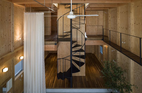
For et deilig sted, det primitive trepanelet mot det florlette tekstilet, som fungerer som romdeler mellom badet og resten av boligen. Liker den åpne planløsningen, men kan være greit å kunne trekke for av og til så man får litt privatliv. Bildene er via Architect-cafe som står bak prosjektet, funnet via Dornob.

What a cool place, the primitive wooden panel and the soft curtain, that works as a divider between the bathroom and the rest of the house, make a wonderful combination. Love the open plan, but see the convenience to pull for now and then to achieve some privacy. Images via Architect-cafe, (the architects of the project), found via Dornob.


the friday files

Do you ever think of just packing everything up and moving to a different country?

I think if I had my choice I would move to Spain or maybe Italy. Their way of life just seems so agreeable. On the one hand it wouldn't be that hard, I do have an EU passport that allows me to work anywhere in the European Union but I can't speak Spanish or Italian to save my life. Recently, I've been catching up on Jordan Ferney's blog posts about moving her family to Paris, France. Like many of us she had a dream to live in another country and this year she made that a reality. When I read about her schedule (she and her husband still work American hours meaning from 6pm-1am France time) I was even more enamored of her lifestyle. It's really inspiring to read about two people making it work and her photos of her life in Paris are just as you imagine it would be.

Of course, it's often images like the ones below that have me hankering to move to Europe. All of these interiors are by Spanish designer Lazaro Rosa-Violan. I am absolutely in love with everything he and his firm Contemporain do. His knack for layering objects and styles is simply sublime.  And once again, I'm kicking myself for not going with the encaustic black and white tiles in our kitchen – see the first image.

Where would you move if you had the choice?


sabato 20 agosto 2011

Leftovers

Fotos von dieser Woche, die ich noch nicht gepostet habe.

Images from this week that didn't make it into posts.

photo: Jacob Termansen via Casa Tres Chic

photo: Pia Ulin

photo: de spec via plus mood found via Kat + Muse


giovedì 14 luglio 2011

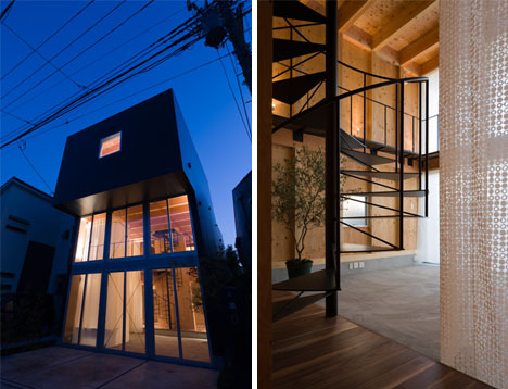
Bare & Grassetto: Open-Piano casa Flips Aree pubbliche e private

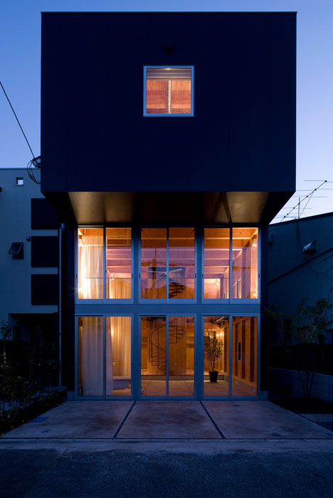
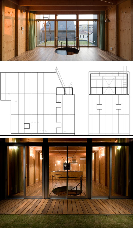
Non adatto per il timido (anche se forse una misura per esibizionisti), questa dimora boxy giapponese gira convenzionale pianificazione residenziale a testa in giù da davanti a dietro.
Un entry-level, front-of-house destra zona bagno in due piani, facciata in vetro imposta solo le basi per una serie di mosse altrettanto strano che rendono il luogo come aspetto molto simile a un teatro pubblico come una dimora privata.
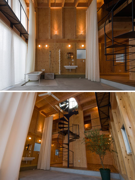
Vasca da bagno, doccia, lavabo e sedersi specchio in una doppia altezza lo spazio, aperta su tutti i lati salvo traslucido tende bianche - come bagni andare, questo è quanto di più audace come si arriva.Spazi cucina, pranzo e soggiorno che normalmente si trovano sulla parte anteriore sono rimboccato attentamente e discretamente lontano.
Una rampa di scale a chiocciola in metallo, si incontra la passerelle avvolgere le ali e guardare in giù sul pavimento sottostante. Una terrazza sul tetto loft si possono trovare una storia più in alto, che agisce come una sorta di ultra-privato cortile di casa (di nuovo: al contrario delle aspettative tradizionali):
Compensato grezzo in cemento nudo e rafforzare la nudità architettonica dell'intera struttura, creata bya  caffè architetto per soddisfare una coppia molto insolita di clienti che valore apertura oltre recinto dalla fondazione alla fine.

sabato 25 giugno 2011

HOME


Yes it is summer and therefore I would like to share with you those beautiful outdoor images.


    Golden dreams

      
    From golden luxury to the rustic modern idyll. From brooding city apartments to moody desert hideaways. Textured luxury with clean lined modern aesthetic. Tribal nuances meld with big city sophistication. It's as delicious as the rich honey tones so often present in the work. It's French design firm Studio KO.